 I must admit I had some reservations about putting myself back into the cut and thrust of hands-on web design and development. After writing and editing articles about the cutting edge at SitePoint, it all felt quite daunting.
It’s not like I haven’t been creating websites the last couple of years (there should be a post soon coming about those sites) but it’s telling that as soon as I left SitePoint three of my long term clients wanted me to do site redesigns.
That was gratifying and exciting. I also pitched for and won a pretty exciting web job, one where the clients had great content and needed a complete design and development effort in a limited timeframe. That site also is almost ready to launch – maybe another week or two.
However, the first cab off the rank has been a redesign for TECO, a client that has been with me since 2008.
As I wrote back then, this job for a company that imports and distributes high tech metal tooling machines came out of my working with the then national peak body for the advanced manufacturing industry.
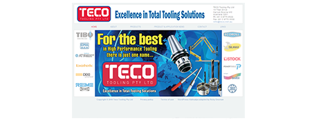
The old TECO site
Since then, I’ve become a kind of inhouse designer for the proprietor, Juergen Schmeja, who has commissioned me to design and build websites for his part-time photography business, his holiday house for hire and a skiing related business he started with his son.
The site I built for The Cottage, Merricks North was my first using a responsive WordPress theme and when Juergen asked me to give the flagship TECO site a makeover, it was obvious to me that I should use a responsive design.
There has been some discussion lately about exactly what responsive web design is and should be called. Everyone agrees that Responsive Web Design as a label and a catchcry was defined by Ethan Marcotte to require the use of three elements: fluid layouts, flexible images, and media queries. Without even one of those, it’s not RWD.
The term also has a use as an uncapitalised summary of an attitude to web design, one that recognises that web design must be responsive – ie, must cater to a range of devices – simply to be good web design. I very much agree with this: if you’re now designing and developing websites that don’t look great and work well on mobiles, tablets, laptops and desktops, you can call what you do web design but it isn’t good web design. Andy Clarke put this well as far back as 2011.
Jeffrey Zeldman points out a kind of parallel with web standards, where a great deal of work went into defining, explaining, promoting and insisting on web standards so that by the time browsers caught up and implemented web standards no-one had to call them web standards any more. Now, they’re just what the web is. Now also, responsive is what the web should be, and will be.
I can’t help but point out a kind of antidote to that, which is that we all agree that an accessible web is not just a nice luxury but a basic right and necessity, but writers on reputable industry sites can talk about CAPTCHAs as a “necessary evil“. That shows a complete and deep-seated disregard for accessibility (grumble, grumble, SitePoint, wouldn’t happen in my day, and hey get off my lawn).
I wrote back in 2007 about the relationship between web standards and accessibility and my preferred goal of “universal accessibility”. Well, now we have a web where standards rule and websites are made accessible – in a very meaningful way – to a range of devices, but not necessarily to the devices used by people with disability.
Clearly, responsive design has been much better marketed than accessibility.
So that was on my mind as I addressed the TECO redesign. I found a WordPress theme called Celestial and started with the “light” version. I liked it enough to buy the pro version so I could set up a proper child theme, but then I had a terrible time getting that to work, so I stayed with Celestial Lite – which has a nice ring to it if you ignore the spelling.
I wanted to have a big slider, on the basis that if I’m going to make it responsive to small screens it also has to fill my wide desktop screen. OK, I know it doesn’t really have to fill the screen but I’ve always wanted to do that.
I used Wooslider for that purpose, but only after I’d tried a couple of other options that didn’t play nice with Celestial. I used Fast Secure Contact Form for the contact page – this has become a standard choice for me as it offers so many customisation options, including multiple forms.
I also installed Cloudflare for performance, Akismet and WordPress Firewall for security, Photo Gallery to display product images (NextGen has been giving me too much trouble lately) and, of course, the Worker plugin that will let me manage the site via my ManageWP dashboard.

The new TECO site
Now that it’s live I’ve (inevitably) found some aspects of the site that require tweaking – notably in terms of responsiveness and accessibility – and while it remains to be seen whether investment in this site redesign gives TECO an edge in an industry that is troubled, to say the least, I’m pretty happy with the end result and, more importantly, so is Juergen.